




Instructions,
for making it yours.
Last updated 30 September 2026
1Start with the variables
Open the Variables panel. Every colour, size, space and radius on the site is a variable, in six collections: Palette (the raw colours, in a Light and a Dark mode), Mood (the five feelings), Colour (what each colour is for — Page, Surface, Text, Accent …), Type, Space and Shape.
Change a value in Palette and every page follows, in both themes. Change what a Colour variable points to and every element that uses it follows. The Style guide page shows them all.
Type and Space have four modes — Desktop, Tablet, Mobile Landscape and Mobile Portrait — tied to Webflow’s breakpoints. The text sizes from LG to 5XL and the section rhythm hold one value in each mode, so they step down on smaller screens by themselves. So does the page’s side margin, Space → Rhythm/Gutter: 24px on Desktop and Tablet, 16px on both phone modes. To change how large a headline is on a phone, change its Mobile Portrait value.
2Fonts
Archivo sets every word — light for headings, regular to semibold for the rest. It is a Google Font under the SIL Open Font License, and the only font the site loads: the wordmark is an SVG image, its letters drawn from Ephesis (also OFL) as outlines.
To use another font, add it in Site settings → Fonts, then change Type → Family/Display or Family/Body in the Variables panel.
3The frame: header and footer
The header and the footer are components: Navbar, Navbar Floating, Navbar Over Photo, Navbar Left, Navbar Twin, Navbar Quiet, Footer and Footer Quiet. Edit one and every page that wears it changes.
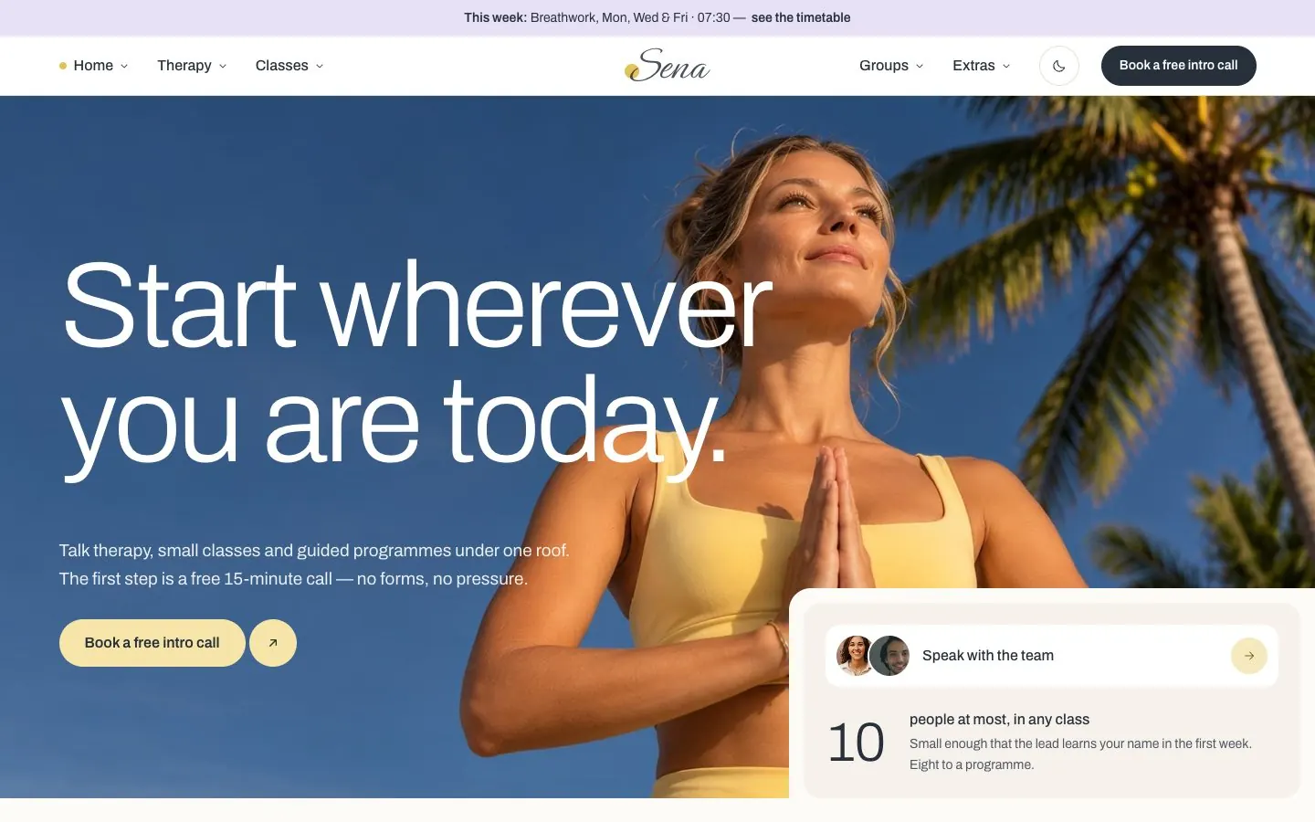
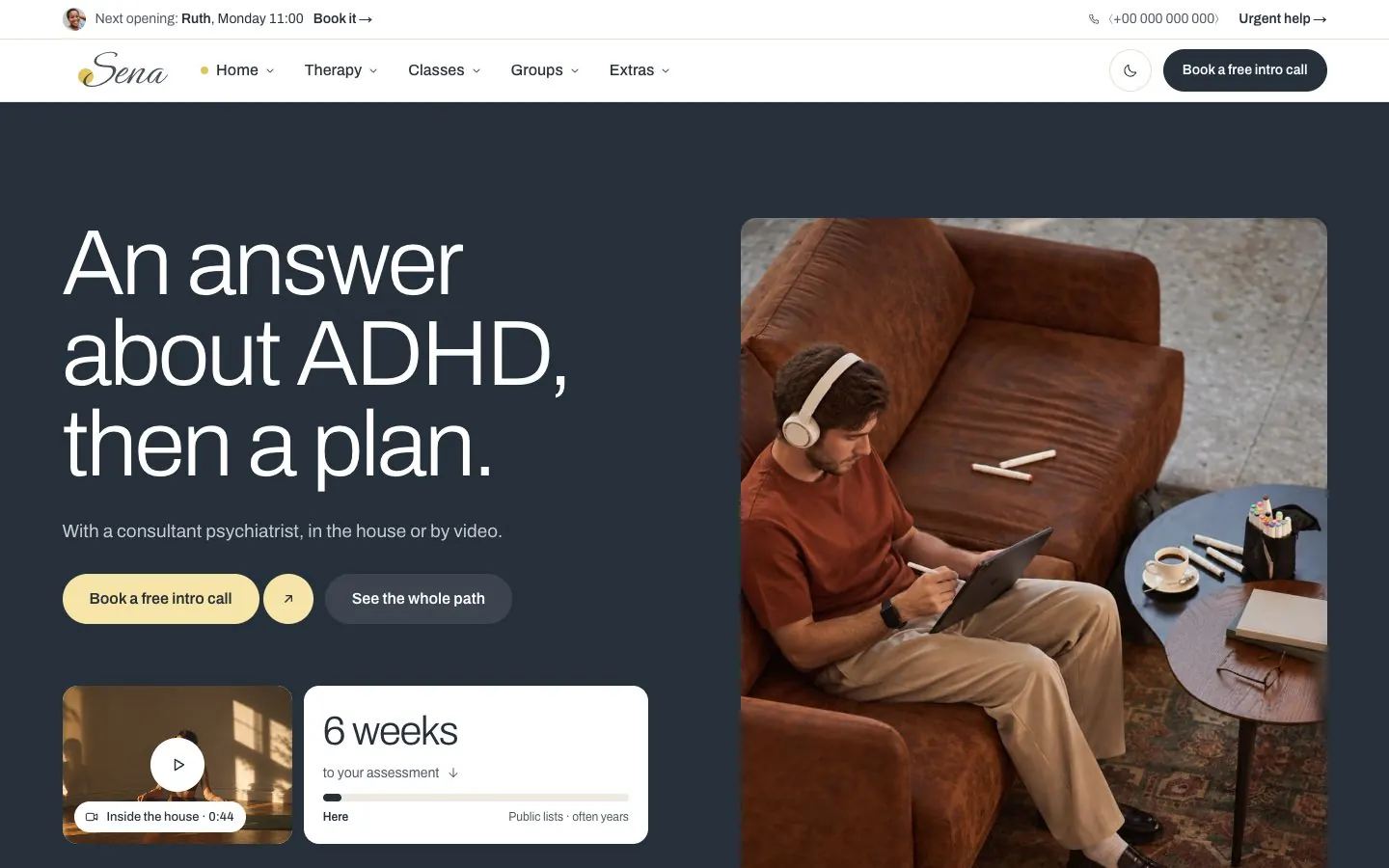
Navbar Floating is the bar that slides in once a page is scrolled; its button's label and link are properties you can set per page. Navbar Left carries a notice line whose photo, words and link are properties too.
The menus open on hover and on click, with Webflow Interactions; the phone menu opens from the menu button below 992 pixels.
The logo is an image, sena-logo.svg, in every header and footer. To use your own, replace it in the Assets panel, or select it in a header and choose another image. The butter disc behind its first letter is a separate element. The image's height is set in em on the class logo_image, so one class serves the header and the footer; over a photograph the class logo_image-light turns it white, and in the dark theme the Palette variable Logo/Invert does.
The closing call to action is a component too, in two shapes: CTA Photo (a heading, a line and a button over a photograph) and CTA Call (a heading, a line, two buttons and two small prints). Their words, links and photographs are properties: select the instance and change them in the panel on the right. A two-line heading takes its break from Shift + Enter.
The film is a component as well: a Background Video with Webflow's own pause button, on five pages. Replace the video once, in the component, and every page follows.
Every button is a component too: Button, with its words, link and arrow as properties and a variant for each look — Primary, Secondary, Light, Glass, Sun, Frosted and Text, most with a Small size. Select a button and change its variant in the panel on the right; change a variant once and every button that wears it follows. The hero's pill with a separate round arrow is Arrow Button, in Sun and Accent. Where a button needs to sit apart from its row — at the bottom of a card, full width, or above a card's link — it is wrapped in a button_wrap, whose combo class says how.
4Pages and sections
Four homepages — Home, Yoga, ADHD and Mental Health — then the inner pages. Every section is built from classes named for what they are (hero_…, pass-tabs_…, closing-photo_…), so one change to a class changes that kind of section everywhere it appears.
To add a page, duplicate the closest one and change its words and photographs. Pages already use the components for the header and footer, so a new page needs nothing else.
5The team and the journal (CMS)
Three collections: Therapists, Class & Programme Leads, and Journal Articles. Each has a template page — /therapist, /lead and /article — built from its fields.
A person's headline is plain text, in Headline text: their name and a comma, then their title on a new line — the heading keeps that line break. The heading above their ways to book and the closing heading are rich text, so the turn after the line break can be set in its own line. Up to three offers, three approaches and three languages show as cards and chips; an empty one hides itself.
A person without a photograph shows the first letter of their name in the photo's place. An article's body is rich text: headings, paragraphs, a quote and lists take the template's styles on their own.
6Forms
The intro-call form on Contact, For Organisations and Startups, and the letter form in the footer, are native Webflow forms: submissions arrive in Site settings → Forms. Set where they are sent in each form's settings.
The choices in the contact form are real radio buttons, so they reach your inbox with the rest of the answer. The text fields are Webflow’s own Text Field and Text Area: a field’s name, type, placeholder and whether it is required are in its Settings panel, and the words shown after sending are the form’s Success and Error states.
7Interactions
Choosers, tabs, the mega menu, the phone menu, dialogs, the FAQ and the floating bar are Webflow Interactions (Interactions panel, site scope). Each is named for what it does, and each adds or removes the classes is-on and is-hidden.
To change what a part does, open its interaction; to change how it looks when it is on, style its is-on combo class. The page you are on is marked by the interaction "Menus: the page you are on, and its section", which runs as a page loads: Webflow gives the open page's links the class w--current, and the interaction adds is-on to them and to the name of their section — a butter dot before the section in the bar and after it in the phone menu, the page’s row marked with a small sun dot and its card ringed in the menus. A new page is marked once it is in its section's menu panel; to change the look, style the is-on combo of the link's class.
The team finder's row filters its cards. Each card carries data-for (Element settings → Custom attributes: therapy, classes or programmes, separated by spaces), and choosing a chip hides the cards that do not match by adding is-off-for. To add a person, duplicate a card and change its data-for; to add a choice, duplicate a chip, change its value, and duplicate its "Team filter: …" interaction. On Startups, each team size has its own number and total (data-size) and each add-on its own line (data-addon). The check-in shows one line and one link for each answer (data-i).
The week on Classes is drawn to scale. Each day is a row from 07:00 to 21:00 (week-hero_label-h-56), and each session is one block in it: a span with a data-key that holds the tile (a button), the teacher’s photograph, the label and the card that opens on click. To change a session’s name or places left, double-click its label beside the tile. The photograph lets clicks through to the tile, so select it in the Navigator (week-hero_image) to change it. The card stays hidden until its tile is clicked: select it in the Navigator (week-hero_layer, or week-hero_layer-pr-12 for an evening session, whose card opens to the left), set Display to Block while you change its words, teacher and links — every card of that class shows meanwhile — then set Display back to None.
A block’s class places it. Left is when it starts and Width how long it lasts, both as shares of the fourteen hours, so an hour is 7.14%: Left is 3.57% for 07:30, 14.29% for 09:00, 37.5% for 12:15, 82.14% for 18:30 and 92.86% for 20:00 (the start less 07:00, divided by 14 hours). Width is max(3.5rem, X%), with X at 3.57% for 30 minutes, 5.36% for 45, 7.14% for an hour and 10.71% for 90 minutes; the 3.5rem keeps a short session big enough to tap. Sessions at the same time share a class (week-hero_label-left-4 is every 07:30 Breathwork), so to move one on its own, add a combo class to its block and set Left and Width there. The tile’s colour is its button’s class: week-hero_button for wired days, week-hero_button-mood-foggy-bg-mood-tint, week-hero_button-mood-heavy and week-hero_button-mood-tired for the others, and week-hero_button-bg-page-subtle for a full session. An evening session has its label before the tile (week-hero_label-mr-12), so it stays inside the row.
To add a session, select a block, duplicate it (⌘D) and drag it in the Navigator into its day’s row; a day with no session shows a dash, so delete the dash. In Element settings → Custom attributes, set its data-key to the class, the day and the time, like sleep-reset-Fri-20:00. It must begin breathwork-, mindfulness-, restorative- or sleep-reset-, because the How’s today? chips light the blocks by that beginning (Wired shows Breathwork, Foggy Mindfulness, Heavy Restorative and Tired Sleep reset). Change its button’s aria-label to match. Tablets and phones show the week as a list instead (week-hero_list-hidden; switch to the Tablet breakpoint to see it): duplicate an item of the same class there, give it the same data-key and change its words; its card (week-hero_wrap) is hidden like the tile’s. Last, change the counts: 9 sessions a week at the top of the page, and the line under the chips (week-hero_text-hidden, one span for each feeling, such as 2 of 9 sessions for Foggy days), which stays hidden until a chip is chosen.
On Home, This week at the house lists the classes (timetable-rows), and with a mouse each row brings up its class’s photograph, which follows the pointer. The photographs sit in timetable-rows_layer above the list, hidden until then: one for each row, in the same order. To add a class, duplicate a row and a photograph and keep the two in step; if their numbers differ, no photograph shows. Select a photograph in the Navigator to change it in Settings. A row’s title link covers the whole row, so select its words in the Navigator too.
Small dots, bars and lines are empty elements. While Show empty elements is on (Canvas settings, ⌘⇧M), Webflow draws an empty element as a 75px placeholder, so each of their classes sets padding right and bottom to 0 and they keep their real size in the Designer. Give a new dot or bar the same, or switch the setting off to see the page exactly as it is published.
Cards that open as a whole carry an invisible link the size of the card (link-cover, inside the card's button), so on the canvas a click on a card's words or photo selects that link. Select what you want in the Navigator instead: it opens on the link, with the card's words and photo just above it. Then press Enter to edit words, or change a photo in Settings.
Parts that show one thing at a time (the pass and photo tabs, the slides, the Yoga day arc, the check-in's answers, the seat price) hide the rest with the is-hidden combo class. To edit a hidden one, select it in the Navigator and take is-hidden off while you edit (click into the Style selector and press Backspace), then add is-hidden back. The FAQ opens and closes on its own: to edit an answer, give its details element the attribute open (Settings → Custom attributes), and remove it when you are done.
The day arc on Yoga is drawn in an SVG (the Embed inside day-arc_wrap-ratio-2): the arc, its hour ticks and each day's coloured sessions, one group per day (data-i 0 is Monday, 6 is Sunday). A day's session times and names on the arc are its day-arc_layer, its heading is its day-arc_layer-flex, and its cards are its day-arc_list below: change a session's words in all three. A session's mark moves only in the SVG. On Home, the Free check-ins card is the front of a small deck that shuffles; the cards behind it sit under it, so select those in the Navigator.
The Style Guide ends with a hidden block, guide_states, that wears every is-on and is-hidden combo class once. Many of them are only ever added by an interaction, and without that block Style selectors → Clean up would list them as unused; deleting them takes away every open, selected and hidden look. Leave the block where it is.
8How to Edit GSAP Animations
All the movement is GSAP, in two places. The arrivals and the rail arrows are Webflow Interactions: open the Interactions panel and search “Arrival” or “Rail”. Everything else — smooth scrolling, dragging the rails, the floating and breathing loops, the parallax, the count-ups and the movement when a tab, quote, photograph or dialog changes — is one GSAP script in Site settings → Custom code → Footer code. The script uses ScrollTrigger and ScrollToPlugin and the interactions use SplitText: keep all three on in Site settings → GSAP integration.
Element Map
Both find what they move by custom attribute, so any of these can go on any element (Element settings → Custom attributes). Each line is a selector and what it does: the first seven are interactions, the rest are the footer script.
[data-watch] — the trigger. Once a fifth of the element is on screen it plays its own arrival, or those of the [data-reveal] elements inside it, one after another.
[data-reveal="words"] — a heading’s words come into focus one after another (SplitText).
[data-reveal="blur"] — the element comes into focus in one piece.
[data-reveal="lift"] — a card, panel or row rises 56px into place, uncovered from its bottom edge.
[data-reveal="print"] — a dome rises from the photograph’s bottom edge and uncovers it, while the image settles from close and soft.
[data-motion="grow-x"] — a bar grows across as its group arrives.
[data-rail] with [data-move="1"] and [data-move="-1"] buttons — the arrows move a row of cards along by one card.
The page — the mouse wheel and the trackpad glide the page instead of stepping it (smooth scrolling).
[data-drag-scroll] — a row of cards can be dragged sideways with the mouse.
[data-motion="animate-float"] and "animate-float-late" — a card floats 8px up and down on a slow breath, the late one half a breath behind; add "float-far" for 24px.
[data-motion="animate-breathe"] — a dot swells and settles; "animate-breathe-ring" — a ring widens and fades around it.
[data-motion="animate-pulse-quiet"] — the small dot on a button pulses softly.
[data-parallax] with a [data-motion="parallax-slow"] layer inside — the layer drifts as the section scrolls away.
[data-js="count-up"] with data-value and data-format — a figure counts up to itself as it comes into view.
[data-motion="animate-word-in"] and "animate-word-in-step" — a phrase comes into focus when a tab, chip or quote switches it in.
[data-stack] with [data-print] photographs — the chosen photograph rises over the last.
.dialog_overlay — a dialog’s panel lifts into place as it opens.
[data-js="timetable-rows"] — on the homepage, the class photograph follows the pointer down the timetable.
[data-js="week-hero"] [data-card] — a session’s card opens with its words in focus, and hangs upward when there is no room below it.
Customizing Key Variables
In the interactions, select an “Arrival: …” interaction and change an action’s Duration (0.8s), Ease (expo.out) or Stagger (0.09s between cards, 0.045s between words). The trigger’s Start, 20% bottom, is when a fifth of the element has entered the window.
In the footer script, every duration, distance and ease is at the top. enter is the duration of every movement, in seconds; glide is smooth scrolling (0 turns it off); EASE holds the three curves.
const TIMING = {
  enter: 0.8, // seconds, an arrival
  breath: 5, // seconds, one slow breath: the floating cards, the breathing rings
  stagger: 0.09, // seconds between the lines of a panel
  rise: 56, // px a dialog travels as it lifts
  float: 8, // px a floating card lifts
  floatFar: 24, // px a far-floating card lifts
  blur: 6, // px, how a phrase starts
  zoom: 1.14, // how close a photograph starts
  parallax: 0.24, // of the window's height, how far a slow layer drifts
  glide: 0.8, // seconds the page glides after the mouse wheel (0 turns smooth scrolling off)
};
const EASE = { enter: "expo.out", quiet: "power1.inOut", glide: "power3.out" };
Delay: add delay to any tween, in seconds. To start the count-ups a moment after they come into view:
gsap.to(count, { n: Number(value), duration: TIMING.enter, delay: 0.2, ease: "power3.out", onUpdate: write, scrollTrigger: { trigger: figure, start: "top 90%", once: true } });ScrollTrigger: start is when a movement begins — "top 90%" is when the figure’s top reaches 90% of the way down the window. The parallax runs from the section’s top at the top of the window to its bottom there, and scrub ties it to the scrollbar:
scrollTrigger: { trigger: section, start: "top top", end: "bottom top", scrub: true, invalidateOnRefresh: true }Removing GSAP Animations
1. Smooth scrolling only: set glide to 0 in TIMING, save and publish. The page then scrolls as the browser does.
2. One effect: in the footer script, delete its block — each starts with a comment naming it (count-up, loops, parallax …). For one element only, delete its data-motion attribute.
3. All of the footer script: Site settings → Custom code → Footer code, delete everything from <script> to </script>, save and publish. The page then scrolls natively, the rails move by their arrows and the trackpad but not by dragging, the loops and the parallax stand still, the count-ups show their final number, and tabs, quotes, photographs and dialogs change at once. Nothing else changes.
4. The arrivals: delete an “Arrival: …” interaction in the Interactions panel to remove that kind everywhere, or an element’s data-reveal to keep only it still. Keep the “Rail: …” interactions, or the arrows stop moving.
Visitors who ask their device for less motion see none of this: the footer script and every interaction stay still for prefers-reduced-motion. Dragging the rails and the week’s cards choosing which way to open stay, because neither is movement for its own sake.
9Dark mode
Dark mode is a variable mode, not a switch. The Palette collection has a Dark mode, and the class theme-dark turns it on for everything inside the element that wears it; Colour and Mood follow, so nothing needs a dark version of its own. For a whole dark page, select the Body and add the class theme-dark. For one dark band, wrap the section in a Div Block whose class is theme-dark (the Style Guide's dark panel is built this way). Take the class off to go back to light. To change a dark colour, open the Variables panel, choose Palette and switch it to Dark.
10Things to replace
The address, phone number, email addresses, registration numbers and legal details are invented: replace them with your own. The numbers on Urgent Help — 112, 116 123 and 50808 — are real services in Ireland, where the demo house is set: change them to your own country’s emergency and crisis numbers before you launch. The legal pages are a starting shape, not advice — have them read before you launch.
The photographs and portraits are yours to use in sites built with this template (see Licenses). Swap them for your own people and rooms when you have them.
Icons (SVG)
Every icon is an Embed element holding one inline SVG: a 24 by 24 drawing with a 1.5 stroke in the colour of the words around it (stroke="currentColor"), so it follows both themes. The five feeling marks and the line drawings are SVG embeds too; their colours are Mood and Colour variables, written as var(--…) in the code.
To change an icon, double-click its Embed and replace what is between the svg tags with your own icon's paths. Keep width="100%", height="100%", the viewBox and stroke="currentColor" on the svg tag: the icon's size comes from the Embed's class (icon, icon-size-16, icon-size-20 …), not from the code.
<svg width="100%" height="100%" viewBox="0 0 24 24" fill="none" stroke="currentColor" stroke-width="1.5" stroke-linecap="round" stroke-linejoin="round" aria-hidden="true">
  <path d="M5 12h14M13 6l6 6-6 6"></path>
</svg>